Let me tell you a little story. Like the making of a movie, I’m taking you behind the scenes to show you how the FingerPaints A Pair Affair nail polish collection came to be. I know I love a good DVD Extras section so I thought you would enjoy seeing how all of this came to fruition.
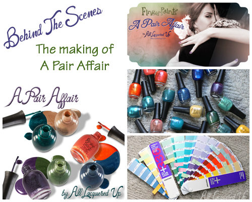
FingerPaints A Pair Affair by All Lacquered Up
You’ll get a peek inside my screwy brain and see the inspiration for the colors that make up the collection. Let’s head down the rabbit hole. No, no, after you…
How It All Began
This story starts in the spring of 2012. I was contacted by Sally Beauty with the idea of creating a nail polish collection for their FingerPaints brand. To say that I was thrilled would be an understatement. I was excited, flattered, overwhelmed and a bit scared to take on such a huge challenge with a brand that big.
Not long after I accepted, I flew to Denton, TX to visit the Sally Beauty headquarters to meet with the FingerPaints Brand Manager and the Sally Beauty PR and Marketing team. I took a tour the offices, including the vintage barber shop and beauty salon filled with products and tools from yesteryear, and viewed the Sally Beauty model store, where I posed for a photo shoot. I even got to see a bit of Denton, including its craft beer scene.
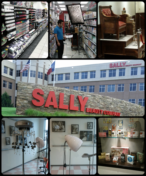
A Visit to Sally Beauty Headquarters
Most importantly, when we sat down to discuss the collection, I was humbled to be given free reign in terms of color. I had walked in with a few ideas to pitch but was quickly told that this collection would be all up to me. The concept, the colors, the names, even the display design. ALL.UP.TO.ME! Talk about terrifying yet amazing.
When I first started ruminating on this whole process the one thing that always stood out was the idea of duos. Maybe it’s the dual-sided nature of my Gemini personality but this concept just stuck with me. I couldn’t shake it. I’m always fielding questions about what color to pair with another and I personally love to mix and match my nail polish shades whether it be on my hands or in a mani-pedi combination. It just made sense.
So with that idea in mind, I started to look at color.

The Color Process
Conceptualizing color was definitely the toughest part of the process. When you have the whole spectrum of color to choose from, how do you narrow it down? And how do you communicate that vision to someone halfway across the country?
I looked to what I love to wear, what I think others will want to wear and how I can put my twist on it. I started thinking about classic pairings like navy and coral. I knew I wanted a teal but needed something to ground it so I started dreaming of a flattering sand tone.
And, here’s a bit of trivia for you. I originally wanted to pair the sage green with a buttery yellow. I had an idea for a yellow everyone would love. One so sparkly and flawless that even yellow haters would adore it. Unfortunately that concept is only possible in my brain, not in chemistry, so yellow turned to purple late in the game.
Allowing the Pantone books to guide me, I found colors that were close to what I wanted. Or, in some cases, a pair of colors that, when mixed, would make my perfect shade. I shared those, along with descriptions of the type of formula, finish and particle I wanted, and waited for my vision to come to life.
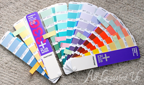
They say you have to kiss a lot of frogs to find your prince. I certainly went through my fair share of frogs before pulling together the six shades that make up A Pair Affair. This is just a taste of all the sample colors I was sent throughout the process.
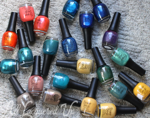
FingerPaints Color Samples
Granted, they aren’t all frogs. Most of them are beautiful and I hope they someday show up in the FingerPaints line. They just weren’t my vision. Though thanks to the patience of Mindy, the FingerPaints Brand Manager, we were able to tweak the polishes to make it happen. I’m sure there are days she wanted throw darts at a picture of my face but we made it through. Anyone who knows me, especially the boyfriend, knows what a “challenge” I am (and that’s putting it nicely).

The Final Colors
As I mentioned above, A Grape Catch, was a last minute addition. When my dream yellow couldn’t materialize, I switched gears completely. In the end, I believe it was fate that the yellow didn’t work out. A collection without a purple just seems wrong now.
Originally this was going to be a glass fleck, like Sage It Ain’t So but the opacity was just too sheer. So in the end, this glorious silvery grape with glitter and glass flecks fulfilled a dream I didn’t even know I had.
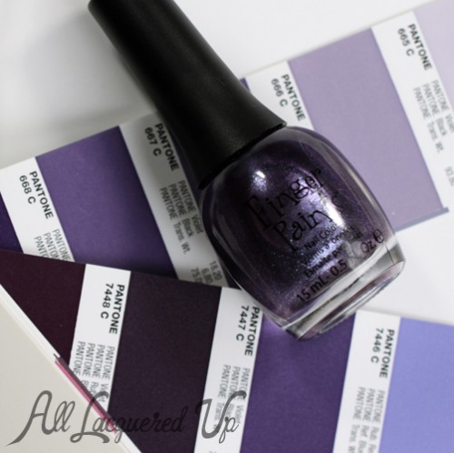
FingerPaints A Grape Catch
So, yes, I own a lot of greens. Like that needs to be said. But in the glass fleck range, they are either minty, dark or vivid brights. With Sage It Ain’t So I wanted a softer, earthier take on glass fleck. I even took the Pantone color I based it on to Home Depot when I changed the color of my living room walls. Paired with A Grape Catch, it’s like I’m wearing a flower on my nails.
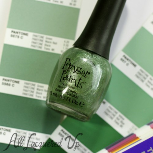
FingerPaints Sage It Aint So
Tan shades can be polarizing. They’re either too pink based or too yellow. With Bare No Secrets I wanted a sparkly sand that would flatter a wide range of skin tones. Mixing a slightly cool base with golden glitter, I feel like I’ve achieved that.
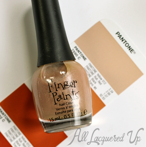
FingerPaints Bare No Secrets
As much as I love all the shades, Our Tips Are Tealed, is the star of this show for me. Whenever I showed my friends swatches of the collection, this one always garnered the most “oohs” and “aahs.” Some may call it emerald (and they have) but this deep, blue-green sparkler is my perfect teal. It’s got a lot of green in its base but the blue shines through as well. It brings a whole party bus of glitter with it that amps up the sparkle to a whole new level.
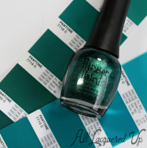
FingerPaints Our Tips Are Tealed
During my visit to Sally Beauty, Lindsey, the Social Media Manager, wore a navy and coral dress from The Webster for Target collection and I made a mental note to explore that pairing. I knew I wanted to stay away from the traditional so holographic glitter suspended in a coral jelly made Sarong So Right special.
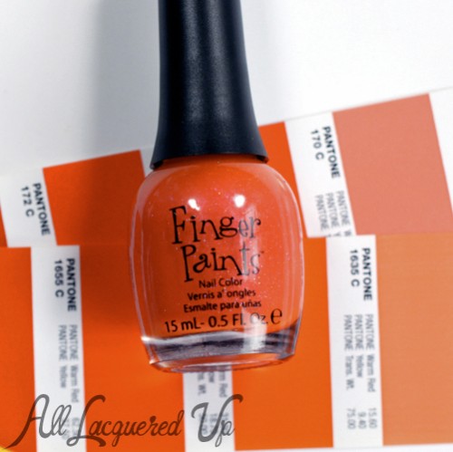
FingerPaints Sarong So Right
When it came to You Yacht To Know Better, I had a really specific concept in mind. There’s a color the sky turns, just before a storm, that I can’t get out of my brain. It’s probably my favorite blue in the world and I feel like I’ve been chasing it since birth. I originally wanted to bring it to life as a foil metallic but this creamy concoction peppered with bright blue glitter captures the feeling so much better.
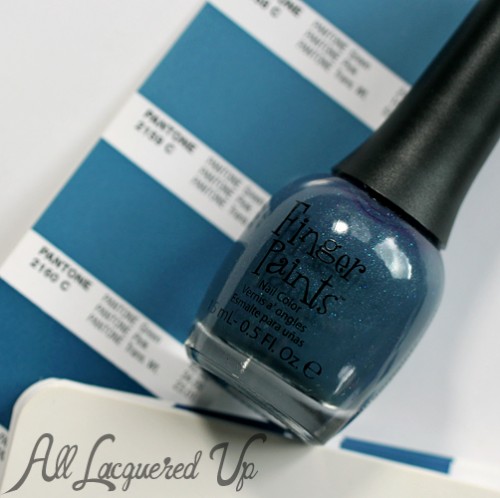
FingerPaints You Yacht To Know Better

The Naming Process
Once the colors were finalized, the daunting process of naming the collection and the individual shades began. It was almost as tough as creating the colors. Almost! And it wasn’t as simple as coming up with one great name. Oh no, you have to submit multiple names to make sure they are legally viable.
Thankfully, I have some amazing people in my corner. The Cleveland social media community is tight-knit and so supportive. I’ve made some great friends through it and, luckily, a lot of them work in advertising, social media and PR. So with the help of my pal Lzone, we put together a dream team of ladies to brainstorm ideas.
Our first meeting was with a small group, to nail down the collection name. We decided to focus on the pair/duo concept and not attach it to a season. To me, these colors are season-less. Fortunately, our favorite, A Pair Affair, got the thumbs up.
Next, I had to name all six colors, which meant coming up with 3-5 names for each shade. It was time for reinforcements so I gathered a group of 12 awesome gals to help. I wanted each duo to have names that played off each while representing the actual color and incorporating the “Affair” part of the collection name.
Sage and Grape are bit more straightforward, based mainly on color, while Yacht references my love of boating and Sarong conjures a beachy feel that works with a nautical name. But it’s a play on words as well. When you do something that is “so wrong” yet “so right,” you “ought to know better.” Same goes for the cheeky Bare No Secrets and Our Tips Are Tealed, the latter being a twist on a song from legendary 80s girl group, The Go-Gos.
I wish I could show you pics from our brainstorming sessions but I can’t because that would reveal names I submitted that weren’t selected. Just know that there was plenty of wine, food and laughter involved. The wine also produced somewhat inappropriate names that, to no one’s surprise, were not approved. And while there were some gems I would have loved to use, all the names perfectly fit the shades.

So there you have it folks. Over a year in the making, this is the tale of FingerPaints A Pair Affair by All Lacquered Up. I hope you enjoyed this behind the scenes look at the creation of the collection and I hope you love the colors as much as I do (though that may not be physically possible).
The FingerPaints “A Pair Affair” by All Lacquered Up nail polish collection will be at Sally Beauty stores nationwide September 2013. FingerPaints nail polish retails for $5.29/ea and is exclusive to Sally Beauty so you can only buy it at the stores or online at SallyBeauty.com. If you purchase online through my links, you help support this site.
Disclosure: Compensation was provided by Sally Beauty for creation of this collection. Product samples were provided by the brand. Affiliate links appear via rewardStyle and Skimlinks. For more info view my Disclosure Policy.